I love taking something dense and making it feel effortless, and PlayoffBlitz was exactly that kind of challenge. The goal was to carry a data-heavy web product onto mobile in a way that stays fast and focused, then prove it with a prototype you can actually use.
I designed the whole mobile experience end to end, matching the existing PlayoffBlitz identity, shaping the app around the three things users do most. I used Figma Make as a prototyping partner to bring the interactions to life, lineup swaps, selection states, and a scrollable stats table, refining every detail by hand until it felt obvious.
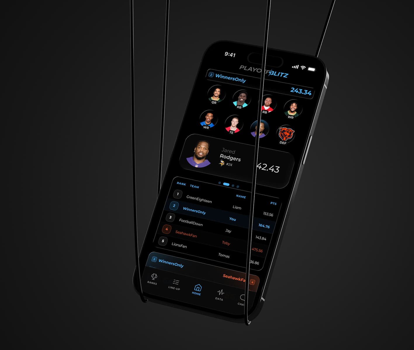
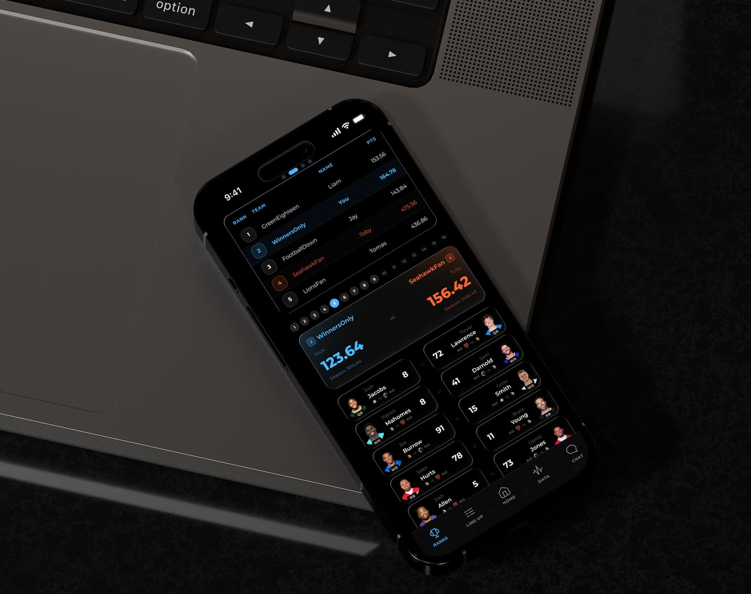
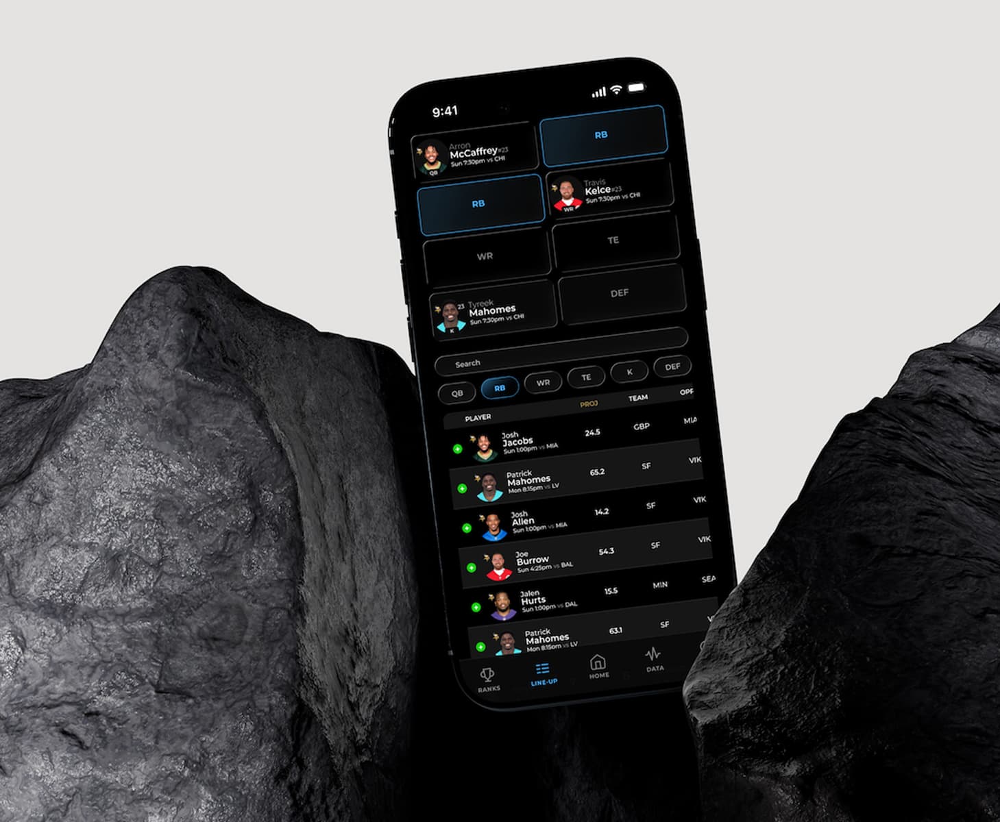
Core sections designed, Set Lineup, Data Center, Standings
Screens designed across the app
Reusable, scalable component system
Live interactive prototypes built
AI-assisted prototyping workflow
One visual system across web and app

The website holds a lot of information, so the core challenge was carrying that depth onto mobile without clutter, keeping dense data readable, and key actions one tap away.
Create a mobile app that feels like a natural extension of the PlayoffBlitz web experience, clear navigation, readable data displays, and quick fantasy actions users can complete without friction.
Audience: fantasy football players & NFL fans. Inputs: the existing website, common sports/fantasy patterns, and usability principles from Steve Krug's Don't Make Me Think.
I started by charting how a user moves through the app, the three core sections, and the actions inside each. Mapping the structure first kept navigation shallow and made sure the most-repeated tasks stayed within a tap or two.
Before any visual polish, I wireframed each screen to test hierarchy, density, and the repeated patterns, stat rows, player cards, list sections, that would carry across the app. Working in low fidelity let me resolve layout and navigation problems early.
Fantasy users bounce between the same repeat tasks, so I organized the app around three sections rather than a deep menu tree, each built for a specific mindset. Here's the prototype in motion, showing all three at once.
After the UI was established, I used Figma Make to accelerate app behavior and build a high-fidelity prototype. Instead of generic click-throughs, I prompted specific behaviors one at a time and refined each to match expected mobile patterns.
Make didn't just speed up building interactions, it surfaced "next step" ideas that improved usability: preventing duplicate selections, clarifying lineup-completion feedback, and finding missing functions worth adding.
The prototype is genuinely interactive, click through the real flows below, right here on the page.
To keep the UI consistent across many screens, I built a small component system that could scale, navigation, headers and back behavior, player cards and stat rows, buttons and action states, alerts, modals, and confirmations, with type and spacing rules for data tables and lists.
The app was designed to feel like one product with the website, matching typography tone, color and contrast, spacing rhythm, and overall interface tone. The same visual system carries across the marketing site, the logged-in product, and the app.
The final prototype shows how the mobile app extends the existing website into a focused playoff fantasy product. A consistent visual system plus realistic interaction behavior makes the concept easy to understand, present, and evolve.